

Tweaking the CSS Code
This is the crucial part of designing - setting how your blog looks like. By this time the widths of all the containers inside the CSS code should have been set. What you need to know about tweaking the CSS code is that it's a recursive process - it's a process of refining that always repeats back and forth until you're 'happy' with the end result.
There are so many things to tweak and so many containers to customize. So how do you do this and where do you start? The easiest approach is to start from the top. Assuming that you're starting from an existing template, at this point you don't have to worry much about customizing the body, outer-wrapper, and content-wrapper, except the width. You can tweak these containers later (or let the existing code as default, unless you want to tweak them later). If you want to use an image as a background image of the whole template, you can also do this later.
Read Tutorial 3: The Structure of CSS Styling Section first if you're not familiar with the basics of the CSS Styling part of the code. Also remember that you should not expect your design to be perfect the first time you do it. It's a process that takes time. To know the basics of tweaking the CSS code, read Tutorial 4: Setting the Properties of a Container. And, if you don't know what containers to customize, read Tutorial 5: Common Containers and Elements in a Blogger Template.
Header:
I'd suggest you start with the Header section. What you commonly need to do here is to set the background color, set how the Blog Title and Blog Description looks like - the font, colors, font-size, etc. If you want to set a large background image as the header image, set it using the Edit Header button in the Page Elements page. The list below is from Tutorial 5.
- #header-wrapper - the container that wraps your Blog Title and Blog Description.
- #header - the container just inside the header-wrapper.
- #header h1 - the command inside this containers controls the appearance and layout of your Blog Title.
- #header h1 a - controls the properties of the Blog Title as a link text.
- #header .description - the properties of your Blog Description.
- #header a img - controls the properties of an image inside your header container.
Main and Post:
The next container to tweak is the Main and Post containers (including the Post-Footer). This one will take most of your time because there's a lot of subcontainers inside it. Infact, Post is a subcontainer of Main. It's usually easiest if you tweak the subcontainers following a certain order. My suggestion is to follow the order below. The list below is from Tutorial 5.
Main:
- #main-wrapper - the container that wraps your Date Header, Blog Posts, Comments, Feed Link, and any widgets that you drag above or below the Blog Posts.
- #main - the container just inside the main-wrapper.
- #main .widget - controls the properties of all widgets inside the main container.
- h2.date-header - sets the properties of your Date Header (just above your Post Title).
- .post - sets the properties of your Blog Posts container.
- .post h3 - sets the properties of your Post Title.
- .post-body p - sets the properties of the body or content of your post.
- .post ul - sets the properties of an unordered list (a list that is not numbered).
- .post ol - controls the properties of an ordered list (a numbered list).
- .post li - controls the properties of the individual list inside an unordered list or an ordered list.
- a img - controls the general properties of an image (the a refers to a link; and an image is by itself a link).
- blockquote - sets the quoted text in your posts.
- code - sets the text contained within the code tags in your posts.
- .post-footer - sets the overall properties of the post-footer container.
- .post-footer-line - sets the properties for each new lines in the post-footer.
- .post-footer a - sets the link text properties inside the post-footer.
- .post-footer .post-comment-link a - sets the "comment" link inside the post-footer.
- #blog-pager - controls the properties of the "newer posts", "home", and "older posts" links.
- #blog-pager-newer-link - controls the properties of the "newer posts" link.
- #blog-pager-older-link - controls the properties of the "older posts" link.
- .feed-links - controls the "Subscribe to: Posts (Atom)" link.
Sidebars:
Once you're done with the above, customize the sidebar. If you have more than 1 sidebar, you may want to customize each sidebar differently. You'll also need to customize the Profile container and the Blog Archive if you want them to be different from other sidebar widgets. The list of container elements from Tutorial 5 are:
- .sidebar-wrapper - the container that wraps all elements and contents in a sidebar.
- .sidebar - the container just inside the sidebar-wrapper.
- #sidebar1 - sets the properties inside sidebar1.
- #sidebar2 - sets the properties inside sidebar2. If you want the properties inside sidebar1 and sidebar2 to be the same, than you can just the properties inside .sidebar and don't have to even write down the #sidebar1 and #sidebar2 in your CSS code.
- .sidebar .widget - controls the properties of all the widgets (the Added Page Element) in your sidebar.
- #sidebar1 .widget - only sets the widgets in sidebar1.
- .sidebar .BlogArchive - sets the Blog Archive properties. Technically, this is a sidebar widget too, but I'm not sure why setting the properties for sidebar widgets doesn't change any properties for the Blog Archive. That's why I have to write down the .BlogArchive command to set its properties.
- .sidebar h2 - sets the title/header properties of a sidebar widget.
- .sidebar #BlogArchive1 h2 -sets the properties of the Blog Archive's title.
- #Profile1 - sets the properties for the About Me block.
- #Profile1 h2 - sets the title/header for the About Me block.
- .profile-img a img - sets the image in the About Me block.
- .profile-textblock - sets the author description About Me block.
- .profile-data - sets the author's data in the About Me block.
- .profile-datablock - sets the overall blocks of data in the About Me block.
Comments:
After the sidebars are done, customize the Comments container next. Post a few test comments to see how they will appear after tweaking. The list of container elements from Tutorial 5 are:
- #comments - sets the overall comment container's properties.
- #comments a - sets the link text properties inside a comment container.
- #comments h4 - sets the header of the comment container.
- .deleted-comment - sets the properties of the deleted comment.
- .comment-author - sets the properties of the comment author.
- .comment-body p - sets the comment body properties.
- #comments ul - controls the unordered list inside a comment container.
- #comments li - controls the individual list inside a comment container.
Footer:
The last container to be customized is the Footer. The list of container elements from Tutorial 5 are:
- #footer-wrapper - the container that wraps all elements and contents inside a footer section.
- #footer - the container just inside the footer-wrapper.
- #footer h2 - sets the properties of the footer title/header.
- #footer .widget - controls the footer widget properties.
- .footer a - controls any footer link texts.
Refining Touch:
Now that you're done customizing all the containers, what you need to do is go back and take a look at your blog as a whole and do some minor tweakings. What I suggest here is you might want to change some font or background colors, font size, margins and paddings, adding borders or changing the borders colors, and so on. But when adding borders, be careful that it might change the width of the container that you're adding the borders on. If there are problems (say that the Sidebar is pushed below the Blog Post), you'll need to increase the width of the parent container that it's in.
The best way to change background and font colors is to have them as variables so that you can use the Fonts and Colors tab in the Layout page. If you're not sure how to do this, just use my Generic Blogger Template as you're starting template. It has plenty of color and font variables to start with.
Labels: Make Template, Tutorial
Start Designing from an Existing Template
If you're a beginner in designing a template, I wouldn't advice you to build a template by writing the codes from scratch; the task is doable but will take you a longer time. So, you don't have to reinvent the wheel! The best way to go about this is by starting from something that's already out there. Choose something close to what you have in mind - for example, choose either a 2-column or 3-column template depending on what you want.
But, when you do this, I strongly urge you not to make the intention of tweaking the code just a little bit and then claiming that the final version is your own design. That is just plain WRONG and UNETHICAL. The starting template is just a starting point, an empty canvas if you will, for you to 'draw' your own template. Use the starting template with the intention that the only thing 'useful' to you are just the Body section (which sets the overall layout and the number of columns), the container titles in CSS code (e.g. #main-wrapper, .sidebar, #sidebar2, .blog-pager, etc), and some 'default' codes that should not be tampered with.
When you're selecting the initial template, I'd advice you to choose a relatively simple template to help you go through the design process easily. If you're not sure which template to start with, you can always use my Generic Blogger Template, a basic 3-column template. If you want to use a 2-column template, read my Tutorial 10 to know how to modify the template into a 2-column template or change the sidebar location.
Labels: Make Template, Tutorial
A Generic Blogger Template
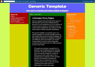 Download
 This is a generic Blogger template meant to be used as a testing and learning template for bloggers who want to learn more about Blogger template design.
Use it together with the tutorial on Blogger Template Design
Labels: Blogger Template, Make Template, Tutorial
How to Embed Images as Background
Blogger Template Design: Tutorial 12
- Tutorial 11: Starting Your Own Blogger Template
A background image can be placed in any container - either inside the Body container (which fills up the entire screen), inside the Post, Sidebar, Comment, or even on a header container (say, a Comment Header). For example, if you look at the Minimalizt template, you'll see that the Comment Header below the post is a rounded green button - which is an image embedded inside the Comment Header.
You can also use an image to create a shadowy-looking side frame (now quite common in blogs). See the Hazy template to see how it looks. To do this, you create a short background image with a long span that fills the whole width of the template. At the right and left edge of the background image, you create the shadowy pattern (or any other pattern that you want to be the frame), and embed this inside the outer-wrapper container, repeating it vertically.
But, how to embed and how to repeat the image vertically, horizontally, or both in directions?
To Embed Background Image:
Say that you want to use a 100 x 100 pixels image as the background image inside the Sidebar1 container. What you need to do is find the sidebar1 {...} container in CSS Styling and add the following code in red (the other codes are just sample codes):
#sidebar1 {
margin: 0px 10px 15px 10px;
padding: 0 0 0 0;
width: 150px;
background: URL(http://the-url-of-your-image) repeat left top;
text-align: left;
}
The "background:..." code will embed whatever image at whatever URL you put and repeat the pattern both vertically and horizontally. The location of the starting image will be on the left-most side, and at the top-most position. The general command for embedding a background image is:
background: URL(http://...) repeat-command x-position y-position;All Repeat Command:
- no-repeat (the image won't be repeated at all)
- repeat (repeat horizontally and vertically)
- repeat-x (only repeats horizontally)
- repeat-y (only repeats vertically)
- left (puts the starting image on the left-most side)
- center (puts the starting image at the center)
- right (puts the starting image on the right-most side)
- top (puts the starting image on the top-most position)
- center (puts the starting image at the center)
- bottom (puts the starting image on the bottom-most position)
Labels: Make Template, Tutorial
Starting Your Own Blogger Template
Blogger Template Design: Tutorial 11
- Tutorial 10: Making a 3-Column Template and More ...
- Tutorial 12: How To Embed Images as Background
The first thing you need to understand about designing a template is that the technique of designing is unique and different between individuals. In the end, it's entirely up to you how you want to do it - if and only if you're familiar and have made a few templates yourself. But if you're just beginning, it's best to follow a step-by-step guide to expedite the process and so that you won't get lost.
Step 1 - Choose an already-made template as a starting point:
For beginners, the easiest and fastest way to start designing is by starting from an existing template. But don't do it with the intention of plagiarizing it! Read more in the sub-post Start Designing from an Existing Template.
Step 2 - Setting the number and location of your sidebar columns:
If you're a beginner, make sure you start with a template that closely resembles the template that you have in mind. For example, if you want to do a 3-column template, don't start with an existing 2-column template. Or, if you want to change or add more sidebars yourself, read more about how to do it in Tutorial 10: Making a 3-Column Template and More ...
Step 3 - Setting the width of your template:
The first thing you need to do after getting a starting template is to set the width of your template. To do this, you need to set the width in the CSS Style code. It's all explained in detail in Tutorial 7: Setting the Template Size. The common containers to set the widths are:
- body
- outer-wrapper
- content-wrapper
- header-wrapper
- main-wrapper
- sidebar-wrapper (or sidebar1, sidebar2, and so on)
- footer-wrapper
Step 4 - Build test objects:
If you're designing a new template, how do you know that what you're tweaking is right if you can't see the changes? So, what you need to do here is build some test objects - for example post 3 or more test posts that have a quote, a numbered list, un-numbered list, make lots of widgets to see how the sidebars look like, make sure you have some Labels to show up in your Labels widget, make some test comments to see how they look, and so on.
Step 5 - Tweaking the CSS code to customize your blog's appearance:
Here is where you start tweaking the CSS code to customize the basic layout of your blog and slowly refining it until you have the template that you want. It's a process that keeps you going back and forth re-tweaking codes because you won't usually get things perfect the first time. Read more detail in the sub-post Tweaking the CSS Code.
Step 6 - Testing in other browsers:
This step can get really annoying, but like they say, you've got to do what you've got to do. Read more in the sub-post Testing and Viewing in Other Browsers.
Step 7 - Using images as background:
If you're bored of using plain color, you can use nicer images as the background of the whole blog or the background of some of the containers (e.g. the Post, Sidebar, Footer, Header, etc). To learn how to do this, click on Tutorial 12: How to Embed Images as Background.
Step 8 (The Final Step) - Finalizing your template:
This step is like the proof-reading stage of your writing. You just need to go through one last step to double check that everything works fine and okay. Look at your blog carefully and see if some minor tweaking will make it look better.
Labels: Make Template, Tutorial
Testing and Viewing in Other Browsers
Personally, I don't like the stage of testing in other browsers. It's annoying that other browsers might show your blog differently than the blogs you're designing it in. But if you want all to have access to your blog and see it as nicely as you've designed it, then you have to go through this process. As for my blog and my demo blogs, I designed them in Firefox and tested in IE7. I've received comments that people using IE6 have some trouble with the templates, but I didn't test them in IE6, and not about to trouble myself downloading IE6 and debugging the codes. The way I see it, if Firefox and IE7 get it right, then it's IE6 that's got the problem (not my templates) and it's IE6 that has to debug itself. Anyway, isn't that why IE7 is made in the first place?
Personally, I think Firefox is by far above all. If you're not using Firefox, I suggest you download them right now - it's free, fast, not too crowded with useless buttons, lightweight, and just plain great. And if you're using IE6 and don't want to upgrade to IE7 because your computer is not fit enough to take the load, but you know that viewing blogs is prone to bugs - then Firefox should be the way to go. Plus, the download is quick, the upgrading is efficient and fast, and there's a lot more to this - but I'll just let you see them on your own. So, if you want to get rid of IE and use Firefox instead, the download button is on the sidebar...
I don't really have a tip for debugging. You just have to be patient and solve the problems one by one. The way I avoid problems is by writing a stricter code so they won't have a chance to flip flop or get 'loose'. If you want, you can start designing a template starting from any of my own templates. That way, you can maintain the part of the CSS code that's there to avoid any bugs in different browsers. But I can't guarantee they're 100% bug-free!
Labels: Make Template, Tutorial
Making a 3-Column Template and More ...
- Tutorial 9: More Explanation about the Body Code
- Tutorial 11: Starting Your Own Blogger Template
One of the most basic desires after becoming a Blogger's blogger and using the standard template for a while is having the urge to find a 3-column template. So, here's a simple and straight-forward tutorial on how to do this yourself without going through too much of code tweaking.
This tutorial is prepared assuming you understand the stuff covered in Tutorial 8 and Tutorial 9, which explain the basics of the Body section of the code.
What we'll be doing to change or add sidebars is simply tweaking the XML code directly from the Blogger Edit HTML page WITHOUT turning the Expand Widget Templates on. This means that the Body section at the end of the code won't be shown cluttered with detailed algorithms for widgets and post data. It'll be as simple as it can be, which is definitely a good thing :).
Adding a Sidebar to Make a 3-column Template:
When you scroll down to the Body section, the code might have something that looks close to this example below (note that you can have slightly different variations of this code for different templates):
Example of a 2-column template:
<div id='content-wrapper'>
<div id='main-wrapper'>
<b:section class='main' id='main'
showaddelement='no'>
<b:widget id='Blog1' locked='true'
title='Blog Posts' type='Blog'/>
</b:section>
</div>
<div class='sidebar-wrapper'>
<b:section class='sidebar' id='sidebar1'
preferred='yes'>
</b:section>
</div>
<!-- spacer for skins that want sidebar
and main to be the same height-->
<div class='clear'> </div>
</div> <!-- end content-wrapper -->
To make another sidebar, what you need to do is simply go to the Edit HTML page and without turning on the Expand Widget Templates box, paste another block of sidebar-wrapper code (shown above in red) before or after the main-wrapper block. For example, to make the Sidebar-Main-Sidebar column, place it before the main-wrapper. Notice in the example below that the id of the 1st sidebar-wrapper is sidebar1 and the id of the 2nd one is sidebar2.
Note: You also have to make sure that the width of both Sidebars and the Main blocks will fit inside the content-wrapper and that the CSS code is properly written for the Sidebars to lay next to each other. Some common mistakes are that one or both Sidebars will fall below the Main block.
Example of a 3-column S-M-S template:
<div id='content-wrapper'>
<div class='sidebar-wrapper'>
<b:section class='sidebar' id='sidebar1'
preferred='yes'>
</b:section>
</div>
<div id='main-wrapper'>
<b:section class='main' id='main'
showaddelement='no'>
<b:widget id='Blog1' locked='true'
title='Blog Posts' type='Blog'/>
</b:section>
</div>
<div class='sidebar-wrapper'>
<b:section class='sidebar' id='sidebar2'
preferred='yes'>
</b:section>
</div>
<!-- spacer for skins that want sidebar
and main to be the same height-->
<div class='clear'> </div>
</div> <!-- end content-wrapper -->
If you want to change a sidebar location to make a 3-column template with a configuration of Main-Sidebar-Sidebar for example, what you need to do is place the sidebar-wrapper block where you want it to appear.
To do this, simply go to the Edit HTML page and without turning on the Expand Widget Templates box, cut the 1st sidebar-wrapper code and paste it in between the main-wrapper and sidebar2 blocks. See the sample code below:
Example of a 3-column M-S-S template:
<div id='content-wrapper'>
<div id='main-wrapper'>
<b:section class='main' id='main'
showaddelement='no'>
<b:widget id='Blog1' locked='true'
title='Blog Posts' type='Blog'/>
</b:section>
</div>
<div class='sidebar-wrapper'>
<b:section class='sidebar' id='sidebar1'
preferred='yes'>
</b:section>
</div>
<div class='sidebar-wrapper'>
<b:section class='sidebar' id='sidebar2'
preferred='yes'>
</b:section>
</div>
<!-- spacer for skins that want sidebar
and main to be the same height-->
<div class='clear'> </div>
</div> <!-- end content-wrapper -->
Labels: Make Template, Tutorial
More Explanation about the Body Code
Blogger Template Design: Tutorial 9
- Tutorial 8: The Body Section of the Blogger Template Code
- Tutorial 10: Making a 3-Column Template and More ...
In this tutorial I'll explain a bit more about some special commands that you'll see in the Body section of the code. Here's the sample code again below:
<body>
<div id='outer-wrapper'><div id='wrap2'>
<!-- skip links for text browsers -->
<span id='skiplinks' style='display:none;'>
<a href='#main'>skip to main </a> |
<a href='#sidebar'>skip to sidebar</a>
</span>
<div id='header-wrapper'>
<b:section class='header' id='header'
maxwidgets='1' showaddelement='no'>
<b:widget id='Header1' locked='true'
title='Blog Title' type='Header'/>
</b:section>
</div>
<div id='content-wrapper'>
<div id='main-wrapper'>
<b:section class='main' id='main'
showaddelement='no'>
<b:widget id='Blog1' locked='true'
title='Blog Posts' type='Blog'/>
</b:section>
</div>
<div class='sidebar-wrapper'>
<b:section class='sidebar' id='sidebar2'
preferred='yes'>
</b:section>
</div>
<!-- spacer for skins that want sidebar
and main to be the same height-->
<div class='clear'> </div>
</div> <!-- end content-wrapper -->
<div id='footer-wrapper'>
<b:section class='footer' id='footer'>
<b:widget id='Text1' locked='false'
title='Blogger Template | JournalBlue' type='Text'/>
</b:section>
</div>
</div></div> <!-- end outer-wrapper -->
</body>
Everything wrapped inside the b:section are the widgets (also called the Page Element). For example, inside the Header is a widget named Header1. Note that this widget contains the code
maxwidgets='1' showaddelement='no'. The maxwidgets='1' means that the maximum widget the header-wrapper can have is 1 only. That means you can't drag a Page Element and place it below or above the Header. The showaddelement='no' means that the Add a Page Element button will not appear in the Header section.In the main-wrapper, you only have the
showaddelement='no' code which means that you won't have the Add a Page Element button there, but you can still drag other widgets and place it above or below the Blog Posts inside the main-wrapper.In the sidebar-wrapper, you have the
preferred='yes' code. This command will create the Add a Page Element button for you to add widgets. Plus, you won't have any limitations on how many widgets you want to add. As you already know, you can always drag the widget to any other wrapper as long as they don't limit the amount of widgets to be displayed in that wrapper.In the footer-wrapper, there's no code following the id command. This means that you won't have the Add a Page Element button but you can drag any widgets into the Footer section.
Labels: Make Template, Tutorial
The Body Section of the Blogger Template Code
Blogger Template Design: Tutorial 8
- Tutorial 7: Setting the Template Size
- Tutorial 9: More Explanation about the Body Code
In this tutorial, I'll explain the basic structure of the Body of the code so that you get the idea on how it works with the rest of your code. The code is located in Section 3 of the Blogger Template Code Structure. This is the main part of the Blogger template code that retrieves the data to be displayed on your blog. It's basically the core part that makes your whole blog functions. The code that sets how it appears on your blog is the CSS Styling code.
Refering back to the tutorial Blogger Template Code Structure, the Body code is in Section 3 as shown in the image below.

Shown below is the Body code copied exactly from the Blogger Edit HTML page with the 'Expand Widget Button' unchecked. I do not want to include the complete code by checking the 'Expand Widget Button' for 2 reasons. First, it's not necessary to do this. You actually don't even have to know what goes on inside the complete code to be able to design a properly working Blogger template. That's all been done 'automatically' by Blogger, which is the beauty of using this new Blogger template as oppose to the old classic ones. Second, by looking at this simpler version of the code, you'll be able to grasp easier the main idea of how all the containers in the template are laid out.
<body>
<div id='outer-wrapper'><div id='wrap2'>
<!-- skip links for text browsers -->
<span id='skiplinks'
style='display:none;'>
<a href='#main'>skip to main </a> |
<a href='#sidebar'>skip to sidebar</a>
</span>
<div id='header-wrapper'>
<b:section class='header' id='header'
maxwidgets='1' showaddelement='no'>
<b:widget id='Header1' locked='true'
title='Testpage Two (Header)' type='Header'/>
</b:section>
</div>
<div id='content-wrapper'>
<div id='main-wrapper'>
<b:section class='main' id='main'
showaddelement='no'>
<b:widget id='Blog1' locked='true'
title='Blog Posts' type='Blog'/>
</b:section>
</div>
<div id='sidebar-wrapper'>
<b:section class='sidebar' id='sidebar'
preferred='yes'>
<b:widget id='Profile1' locked='false'
title='About Me' type='Profile'/>
<b:widget id='BlogArchive1' locked='false'
title='Blog Archive' type='BlogArchive'/>
<b:widget id='Label1' locked='false'
title='Labels' type='Label'/>
</b:section>
</div>
<!-- spacer for skins that want sidebar
and main to be the same height-->
<div class='clear'> </div>
</div> <!-- end content-wrapper -->
<div id='footer-wrapper'>
<b:section class='footer' id='footer'>
<b:widget id='Text1' locked='false'
title='Blogger Template | Bordr' type='Text'/>
</b:section>
</div>
</div></div> <!-- end outer-wrapper -->
</body>
- Header (in red)
- Main (in green)
- Sidebar (in red)
- Footer (in brown)
Inside this large container, you'll see 3 wrappers - header-wrapper, content-wrapper, and footer-wrapper. They are positioned vertically with the header-wrapper being at top and the footer-wrapper being at the bottom. It's simply because in the code, the header-wrapper is called first, followed by the content-wrapper, and finally the footer-wrapper. At this point, you don't even have to know what's inside the content-wrapper - this makes it much cleaner and easier as oppose to not having the content-wrapper and having to deal with the main-wrapper and sidebar-wrapper together all at once. It'll be a big mess then.
Because the outer-wrapper is the largest wrapper, you have to make sure that the widths of all the other wrappers inside it is less or at least equal to the outer-wrapper's width. But, if you add borders, that'll add extra pixels to whichever wrapper that you're adding the borders too. So be careful when adding borders!
Adding a new wrapper (container) in between any of these wrappers is easy. Just paste in a wrapper code (see below for example) and rename it with a new name, say a banner-wrapper. The preferred='yes' command will make an 'Add Page Element' button that'll allow you to create new widgets.
<div id='banner-wrapper'>
<b:section class='banner' id='banner'
preferred='yes'>
</b:section>
</div>
Inside the content-wrapper, you have the main-wrapper and sidebar-wrapper. To have these two wrappers side-by-side as commonly seen in blogs, you have to set the widths of these 2 wrappers such that it's equal or less than the width of the content-wrapper. Plus, you have to add certain commands in the CSS Styling code so that they'll sit next to each other. Otherwise, they'll just fall vertically on top of one another. Typically, you need to use the 'float:left' command for this. See some template examples to check more on this. If you want to add more sidebars, say a 3-column template, you simply need to add more sidebar-wrapper code (in blue). Read more in Tutorial 10 to know how to add or change sidebars.
Once you've understood the basic idea behind the Body code, it's easy to see now why the common structure of the Blogger template code looks the way it is (see below for a 3-column example). If you want to rearrange or add new containers or wrappers, what you simply need to do is to modify the Body of the code. It's that easy! But then, you have to tweak the CSS code to set how it's gonna look in the blog.

Labels: Make Template, Tutorial
Scale model your designs in line
 This application consists essentially of the following thing:
HTML - Here you select the amount of elements to contain the information like the head, the footer and the number of columns.
CSS - From you can here select to the location and size of each element.
Add elements - Once you do dice click in “add” in some element, from this panel you can add boxes of content, columns, lists, headed or text fields.
Once you find constructed your design you can give click in “ToggXuất bản Bài đăngle View” to have a previous Vista and “Get Code” to obtain code CSS and HTML of your design.
Site: http://builder.yaml.de/
Labels: Blog help, CSS, Make Template
Setting the Template Size
- Tutorial 6: Using the Generic Blogger Template
- Tutorial 8: The Body Section of the Blogger Template Code
Setting the template size is probably one of the first things you need to do when starting to design a new template. The are two ways to set the size (basically the width) of a template:
- Setting the size to be fixed with a certain width, say 800 pixels.
- Setting the template to have a fluid size, which means the width changes with the browser or screen size.
To set a template width, you actually have to set the width of a few large containers. The most common containers to set the widths are:
- Body
- Outer-wrapper
- Header-wrapper
- Content-wrapper
- Footer-wrapper
- Main-wrapper
- Sidebar-wrapper*
- Footer-wrapper
In most of my newest templates, I also set the widths in the containers just inside some of the wrapper containers (which is redundant) to avoid some minor alignment bugs that may appear. The widths of these containers are set equal to the widths of their parent wrapper containers. These containers are:
- Header
- Main
 Here is a sample code from the Generic Blogger Template showing you all the container widths that are set to make sure the template width is properly set (only the part that concerns the width-setting are shown). In this sample, the template width is set at 800 pizels.
body {
min-width: 800px; }

#outer-wrapper {
margin: 0 auto;   /* to make the template lays in the screen center */
min-width: 800px;
max-width: 800px; }

#content-wrapper {
min-width: 800px;
max-width: 800px; }

#header-wrapper {
min-width: 800px;
max-width: 800px; }

#main-wrapper {
min-width: 400px;
max-width: 400px; }

.sidebar {
padding: 10px 10px 10px 10px;
min-width: 180px;
max-width: 180px; }

#sidebar1 {.....}
#sidebar2 {.....}

#footer-wrapper {
min-width: 800px;
max-width: 800px; }

The body is set with a command min-width = 800px, which means that the smallest width it should have is 800px. If it's set with a command width = 800px only, then the template width might shrink in some situation. Setting it with a min-width guarantees the smallest size it will take.
The next container just inside the body is the outer-wrapper. It's usually common to set it with a command width = 800px only. But as I've explained about my strictness in setting the width to avoid any alignment bugs, it's becoming my habit to always set the container to have a min-width and max-width of the same value so that the container size is exactly that size - it will not shrink or widen to any different value. Another thing about the outer-wrapper is that this is where you set the command to either place your template at the center of screen or float to the left of it. In this case, setting margin: 0 auto will float the template to the center. Just writing margin: 0 will float it to the left as a default position.
The next 3 large containers, the header-wrapper, the content-wrapper, and the footer-wrapper is usually set to be the same size; in this case it's 800px. In any case, they can be set smaller than the outer-wrapper width but not any bigger than that because the outer-wrapper 'wraps' these 3 containers inside it. Another thing, if you add left and right borders, then you'll increase the width, and the outer-wrapper will just cut out whatever that's bigger than itself on the right side. So, if you do add borders, say 2px left and 2px right for the header-wrapper, then you have to set the header-wrapper width to be 796px so that the total would be 796+2+2 = 800px. The same goes for all the other containers.
The last 3 containers are the 2 sidebars and the main-wrapper. Because they sit side by side, you have to make sure the total width = 800px or less, but certainly not more. In this case, I set the main-wrapper to be 400px and both the 2 sidebars to be 200px. But because I added padding of 10px left and right of each sidebars, which pushes the sidebar border outward, I'd have to reduce the sidebar width to be 180px so that the total sum after adding the pads would be 200px. You have to note that the largest sidebar container is the sidebar-wrapper (not just the sidebar). I could have set the width of the sidebar-wrapper instead of the sidebar, but I prefer to set the sidebar width because sometimes I may set the 2 sidebars to have different widths. But, this is all just a matter of personal style; other template designers may have different way of setting this sidebar widths. As long as it works, that's all that matters.
Setting a fluid template size:
To set a template with width that changes with browser or screen size, please refer to W3Schools Tutorials for more details. In my templates, I haven't made any such templates and so my experience in setting a fluid sized template is not much. Once I have more experience in this, I'll post the tutorials on it.
Labels: Make Template, Tutorial
Common Containers and Elements in a Blogger Template
- Tutorial 4: Setting the Properties of a Container
- Tutorial 6: Using the Generic Blogger Template
These common elements that I'll show are not necessarily the elements that exist or must exist in all Blogger templates, but are just some common elements that controls a large part of your template style. Knowing these elements will make it a lot easier for you to know where to look for in the template code and how to deal with other new elements that you may find in other templates.
I'm not going to list all the elements, but only enough elements so that you get the ideas and can understand all the other elements on your own. I will refer to the images from the below to CSS Styling Section make things easier to follow.

The symbols # and . show the attributes of the element (sort of a classification of the element type). But you don't have to worry much about this for now. If you want to know more about this, I suggest the W3Schools tutorials.
Global:
- body {.....} - general properties for the whole template.
- #outer-wrapper {.....} - the starting and largest container for all your template contents. Inside this is the header-wrapper, content-wrapper, and footer-wrapper.
- #content-wrapper {.....} - the wrapper that contains sidebars and main containers.
- a {.....} - this sets the overall properties of your link text.
- a:visited {.....} - this sets the overall properties of your visited link text.
- a:hover {.....} - this sets the overall properties of your link text when the mouse hovers over it.
Header:
- #header-wrapper - the container that wraps your Blog Title and Blog Description.
- #header - the container just inside the header-wrapper.
- #header h1 - the command inside this containers controls the appearance and layout of your Blog Title.
- #header h1 a - controls the properties of the Blog Title as a link text.
- #header .description - the properties of your Blog Description.
- #header a img - controls the properties of an image inside your header container.

Main:
- #main-wrapper - the container that wraps your Date Header, Blog Posts, Comments, Feed Link, and any widgets that you drag above or below the Blog Posts.
- #main - the container just inside the main-wrapper.
- #main .widget - controls the properties of all widgets inside the main container.
- h2.date-header - sets the properties of your Date Header (just above your Post Title).
- .post - sets the properties of your Blog Posts container.
- .post h3 - sets the properties of your Post Title.
- .post-body p - sets the properties of the body or content of your post.
- .post ul - sets the properties of an unordered list (a list that is not numbered).
- .post ol - controls the properties of an ordered list (a numbered list).
- .post li - controls the properties of the individual list inside an unordered list or an ordered list.
- a img - controls the general properties of an image (the a refers to a link; and an image is by itself a link).
- .sidebar-wrapper - the container that wraps all elements and contents in a sidebar.
- .sidebar - the container just inside the sidebar-wrapper.
- #sidebar1 - sets the properties inside sidebar1.
- #sidebar2 - sets the properties inside sidebar2. If you want the properties inside sidebar1 and sidebar2 to be the same, than you can just the properties inside .sidebar and don't have to even write down the #sidebar1 and #sidebar2 in your CSS code.
- .sidebar .widget - controls the properties of all the widgets (the Added Page Element) in your sidebar.
- #sidebar1 .widget - only sets the widgets in sidebar1.
- .sidebar .BlogArchive - sets the Blog Archive properties. Technically, this is a sidebar widget too, but I'm not sure why setting the properties for sidebar widgets doesn't change any properties for the Blog Archive. That's why I have to write down the .BlogArchive command to set its properties.
- .sidebar h2 - sets the title/header properties of a sidebar widget.
- .sidebar #BlogArchive1 h2 -sets the properties of the Blog Archive's title.
Technically, the Profile (About Me) container is placed inside a sidebar, but I'm putting it in the Miscellaneous section because there are many smaller elements that belong together with the Profile container and putting it in the Miscellaneous reduces the mess.
- #Profile1 - sets the properties for the About Me block.
- #Profile1 h2 - sets the title/header for the About Me block.
- .profile-img a img - sets the image in the About Me block.
- .profile-textblock - sets the author description About Me block.
- .profile-data - sets the author's data in the About Me block.
- .profile-datablock - sets the overall blocks of data in the About Me block.
- blockquote - sets the quoted text in your posts.
- code - sets the text contained within the code tags in your posts.

Post-Footer:
- .post-footer - sets the overall properties of the post-footer container.
- .post-footer-line - sets the properties for each new lines in the post-footer.
- .post-footer a - sets the link text properties inside the post-footer.
- .post-footer .post-comment-link a - sets the "comment" link inside the post-footer.
- #blog-pager - controls the properties of the "newer posts", "home", and "older posts" links.
- #blog-pager-newer-link - controls the properties of the "newer posts" link.
- #blog-pager-older-link - controls the properties of the "older posts" link.
- .feed-links - controls the "Subscribe to: Posts (Atom)" link.
- #comments - sets the overall comment container's properties.
- #comments a - sets the link text properties inside a comment container.
- #comments h4 - sets the header of the comment container.
- .deleted-comment - sets the properties of the deleted comment.
- .comment-author - sets the properties of the comment author.
- .comment-body p - sets the comment body properties.
- #comments ul - controls the unordered list inside a comment container.
- #comments li - controls the individual list inside a comment container.
- #footer-wrapper - the container that wraps all elements and contents inside a footer section.
- #footer - the container just inside the footer-wrapper.
- #footer h2 - sets the properties of the footer title/header.
- #footer .widget - controls the footer widget properties.
- .footer a - controls any footer link texts.
Labels: Make Template, Tutorial
 -->
-->